Custom fonts for Domino’s
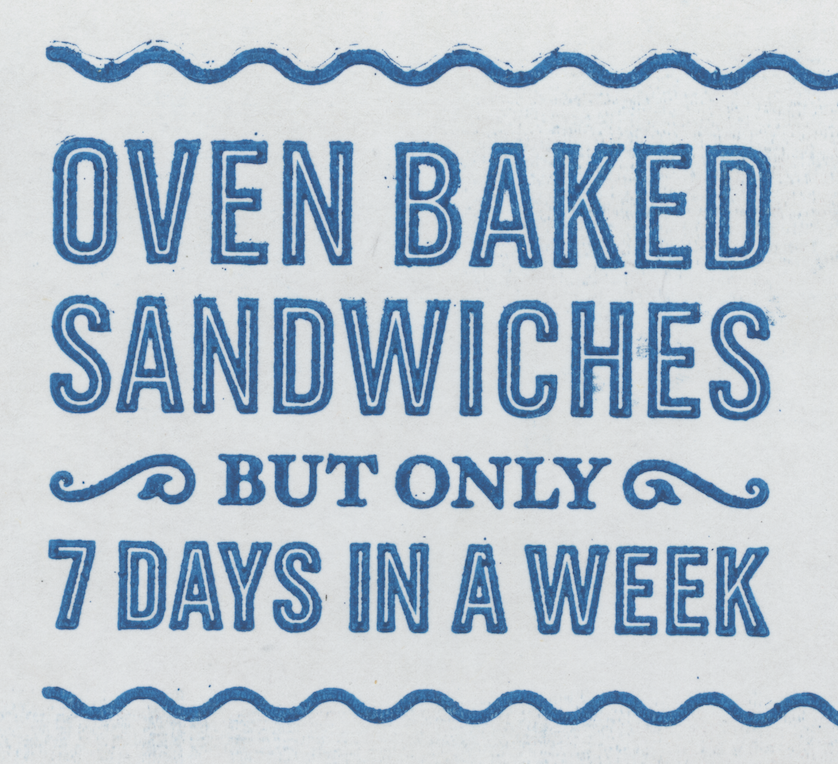
Working under the Monotype Studio flag, and with art direction from ad agency CP+B, I created a series of custom fonts for the Domino’s Pizza brand. These are modeled after 19th Century condensed American gothic sans serif typefaces, designed to fit with Trade Gothic®, which was also used in some places. The fonts can be layered for striking visual effects. The striped shadow style even comes in optical sizes; Antique for smaller setting, and Antique Display for larger setting. Art Direction by Mel Rhyner.
In 2017 and 2018—once again with CP+B—we expanded the Sans into a full family called One Dot, which includes Condensed, Regular and Extended styles. I also designed new transitional serif called Two Dots complete with swash caps and italics. Lynne Yun and Carl Crossgrove contributing.

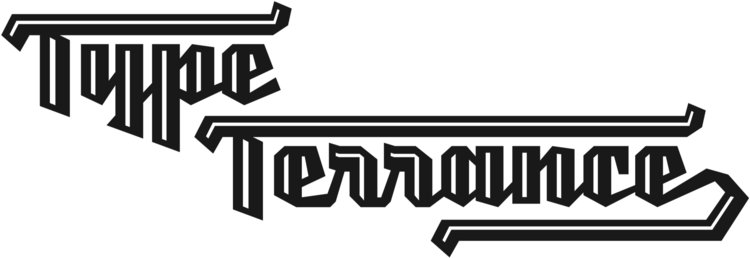
Multiple layers of Pizza Press

One Dot and Two Dots family overview.


An Old School workaround, we mapped the ornaments to usual Unicode positions. Some are designed to be repeated into a pattern.
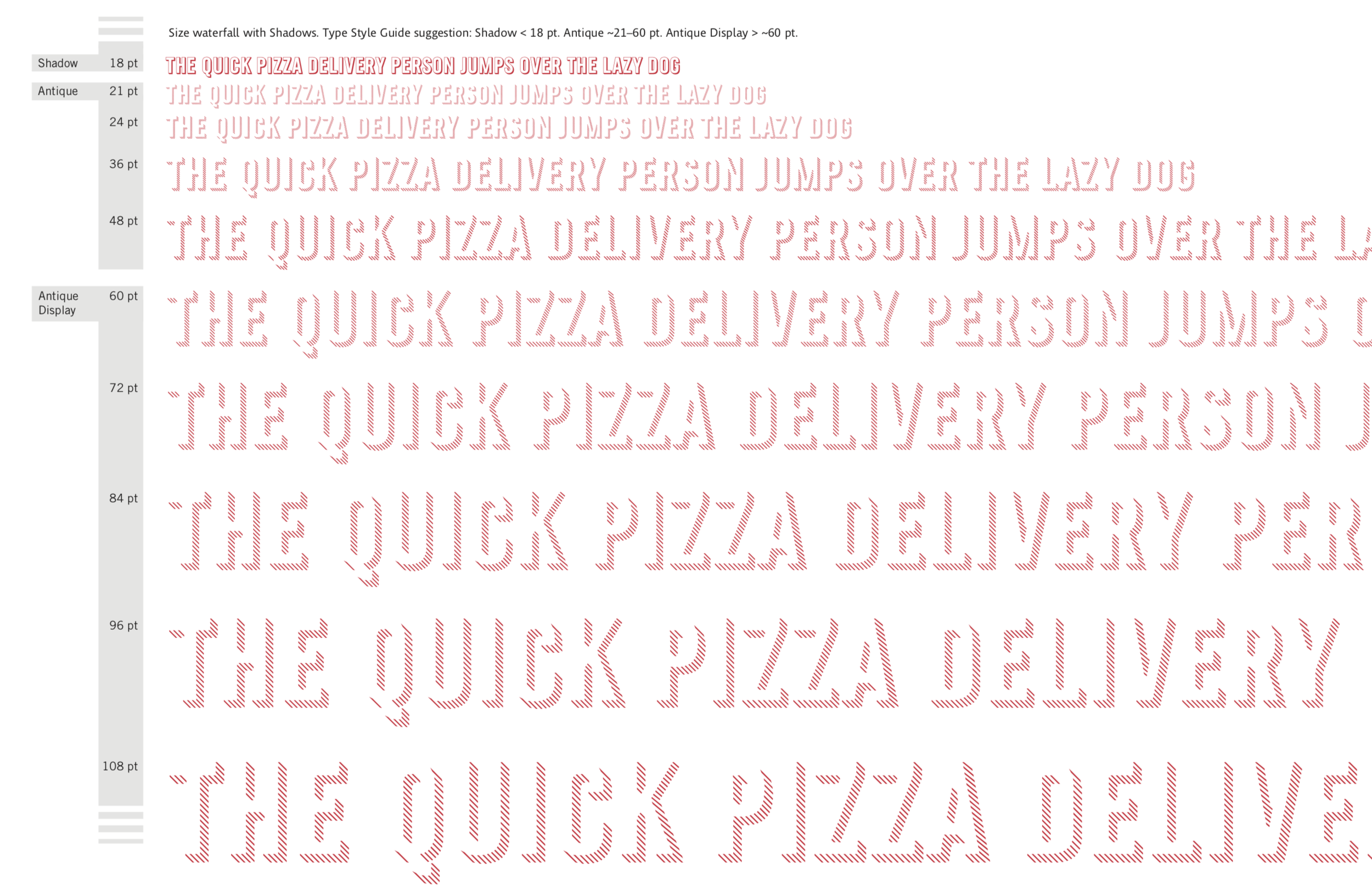
Waterfall demonstrating the Shadow optical sizes. Bigger is thinner, smaller is thicker.
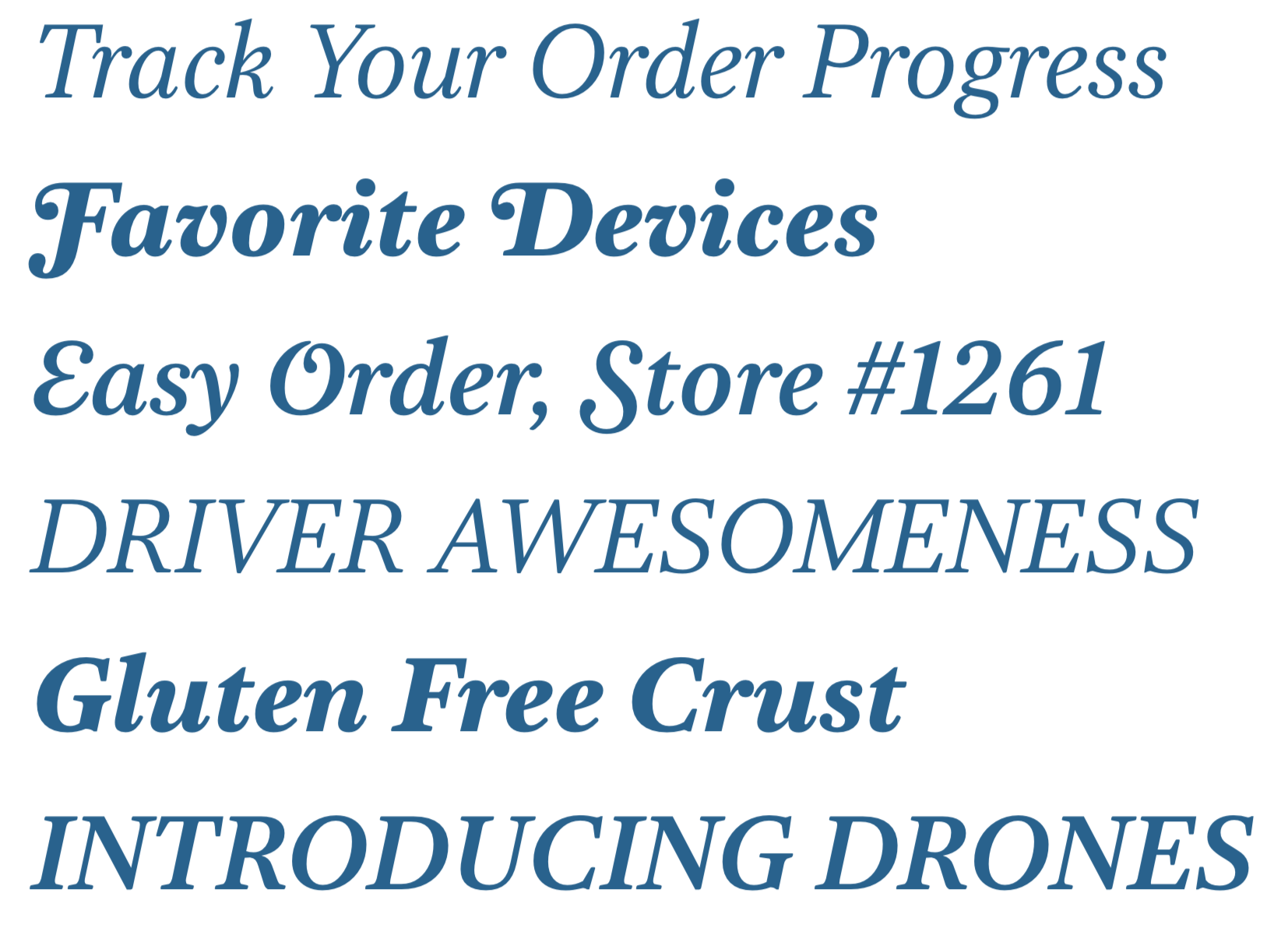
Two Dots Italics with Swash Capitals, 2017
In Use

Flexographic printing

Also seen on Dominos.com, in apps, TV spots, etc.