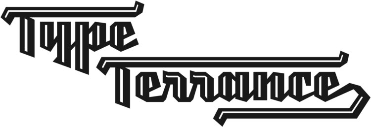
My Terry Junior typeface is a perfectly imperfect design – one that retains the marks of the brush used to create it and harks back to the craft required to hand make letterforms. Originally drawn during a Monotype Font Marathon, I later refined the typeface digitally – adding an Inline version and designing alternates that replicate the irregularity of real-life brush scripts.
It has a natural, cheery and bold appearance. It’s young, but not wild. Painted, but not sloppy. A sign painter’s apprentice, perhaps.
Terry Junior is an obvious choice for designers and brands communicating with younger audiences, but would also work well on book covers, packaging, and in digital environments that need a little bit of extra playfulness. The family includes five fonts, including an Inline version.
Process of analog and digital design.
Typeface by Terrance Weinzierl. Graphic design by Beth Fileti of Polite Type. Published by Monotype.


